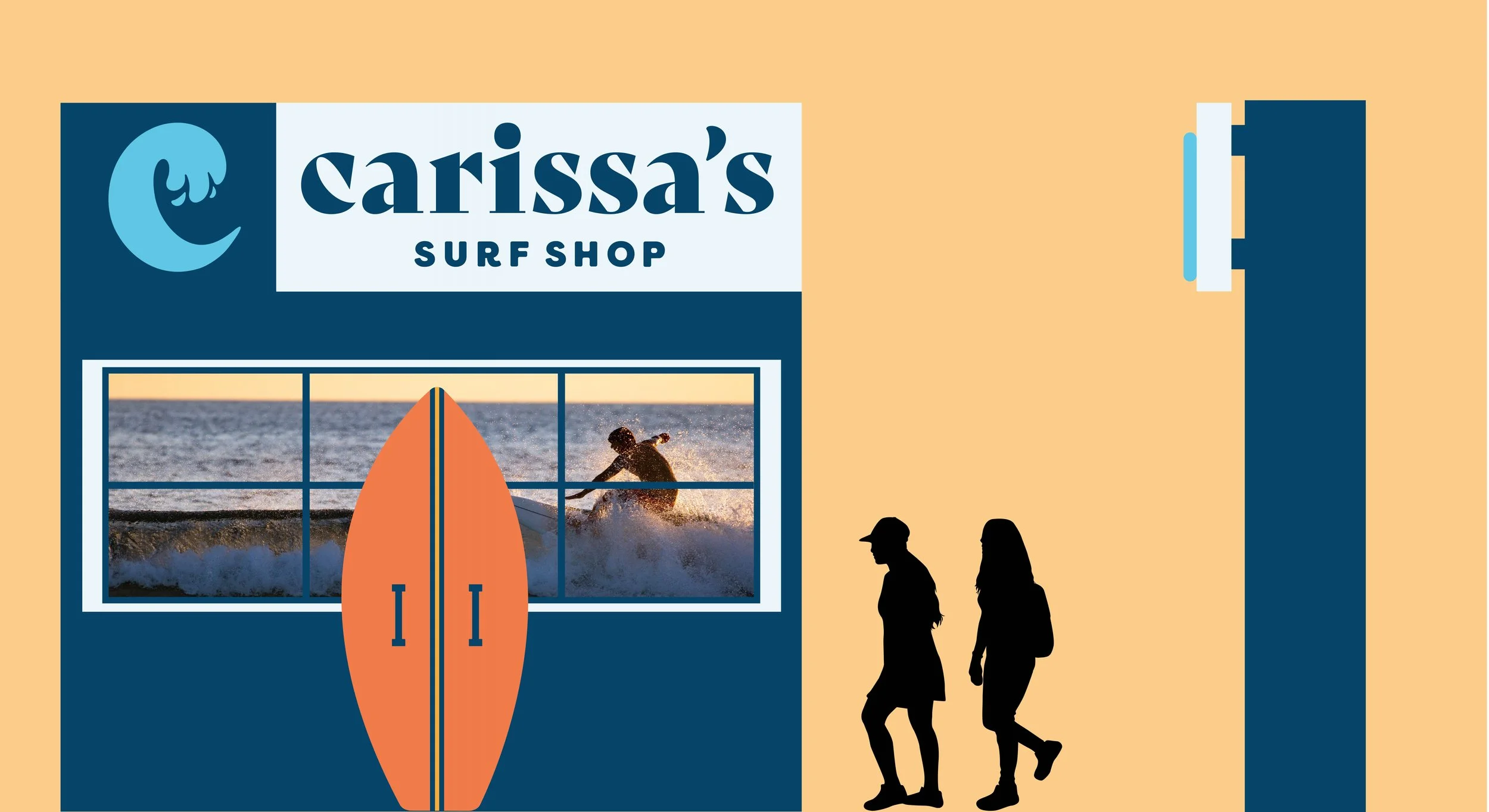
Carissa’s Surf Shop
Carissa’s Surf Shop is named after Hawaiian Olympian and five-time World Surf League champion Carissa Moore. Through the sport of surfing, the Olympian inspires people of all ages to be strong and confident. With a wide selection of surfboards, wax, accessories, and clothing, our shop is a true surfers’ paradise. At our surf shop, we strive to provide high-quality equipment to surfers of all levels. Among our staff, you’ll find friendly, beach-loving, knowledgeable, and passionate surfers.
Research, Branding, Packaging, Environmental Graphic Design

Approach
Drawing inspiration from both Carissa Moore and the vibrant Hawaiian lifestyle, I created a brand identity that embodies a bold and groovy aesthetic, utilizing dynamic pattern illustrations and vivid colors. The process began with the creation of a morphological logo and expanded to packaging design as well as environmental graphic design.

Packaging Re-search
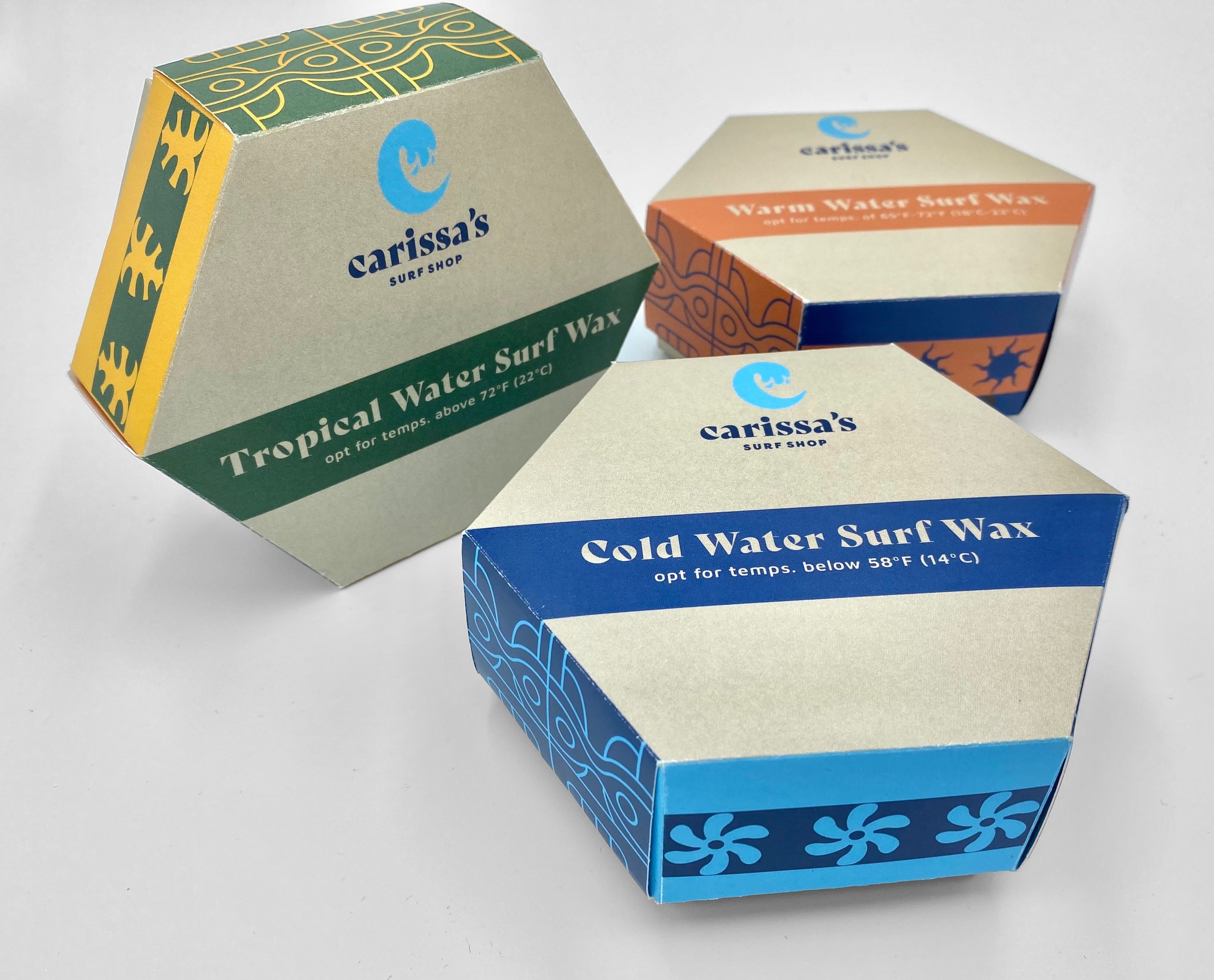
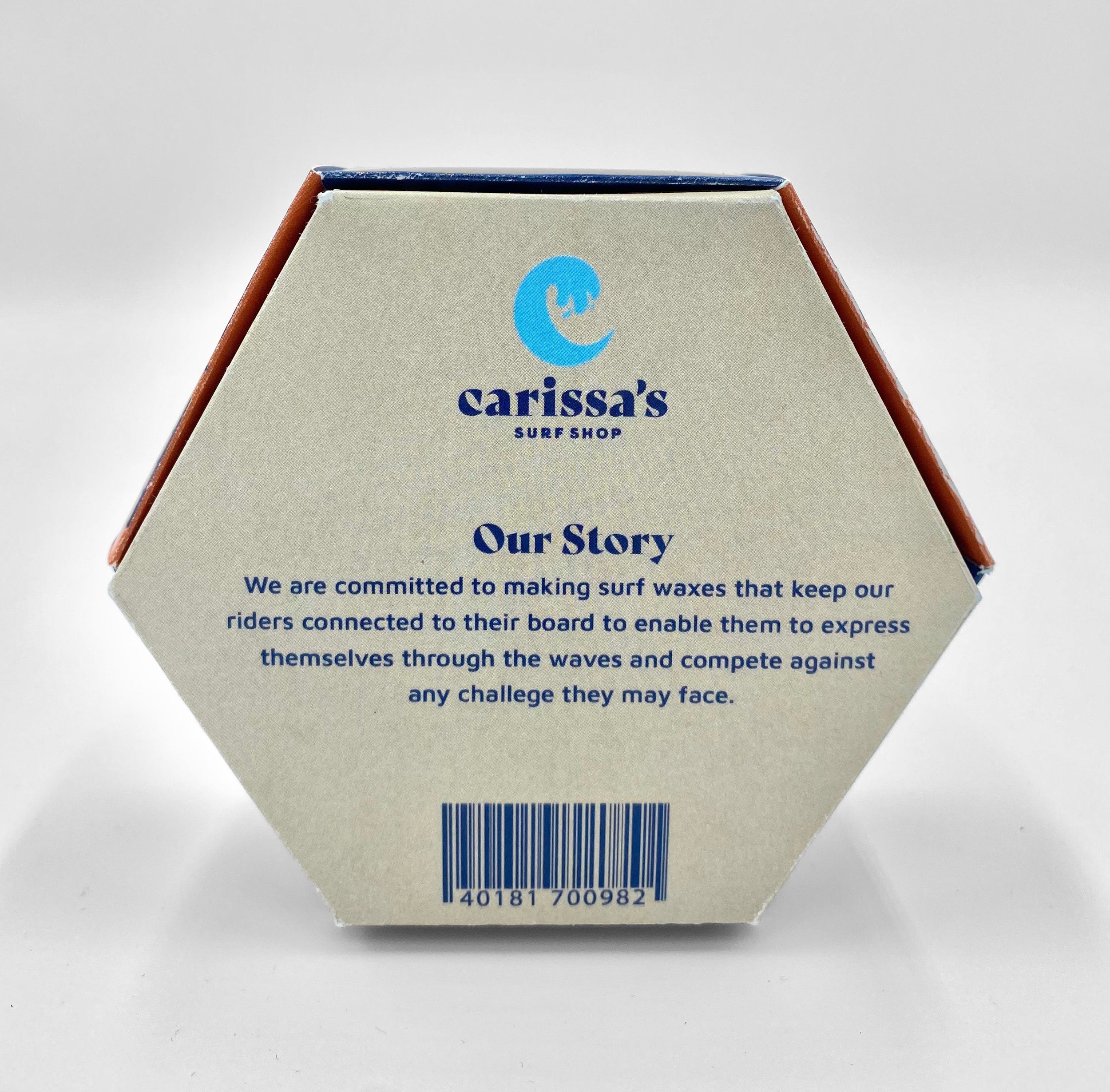
Following the development of the trademark, I expanded the brand identity by creating a packaging system aimed at the surfing community. As a crucial product that surfers rely on for traction and to prevent slipping off their boards, surfing wax comes in different varieties to suit varying water temperatures and seasons, such as Tropical Wax, Cold Wax, and Warm Wax. The application of the appropriate wax on the board is essential for maximum adhesion, as each wax is specifically formulated to withstand particular temperatures.
Packaging Design Process
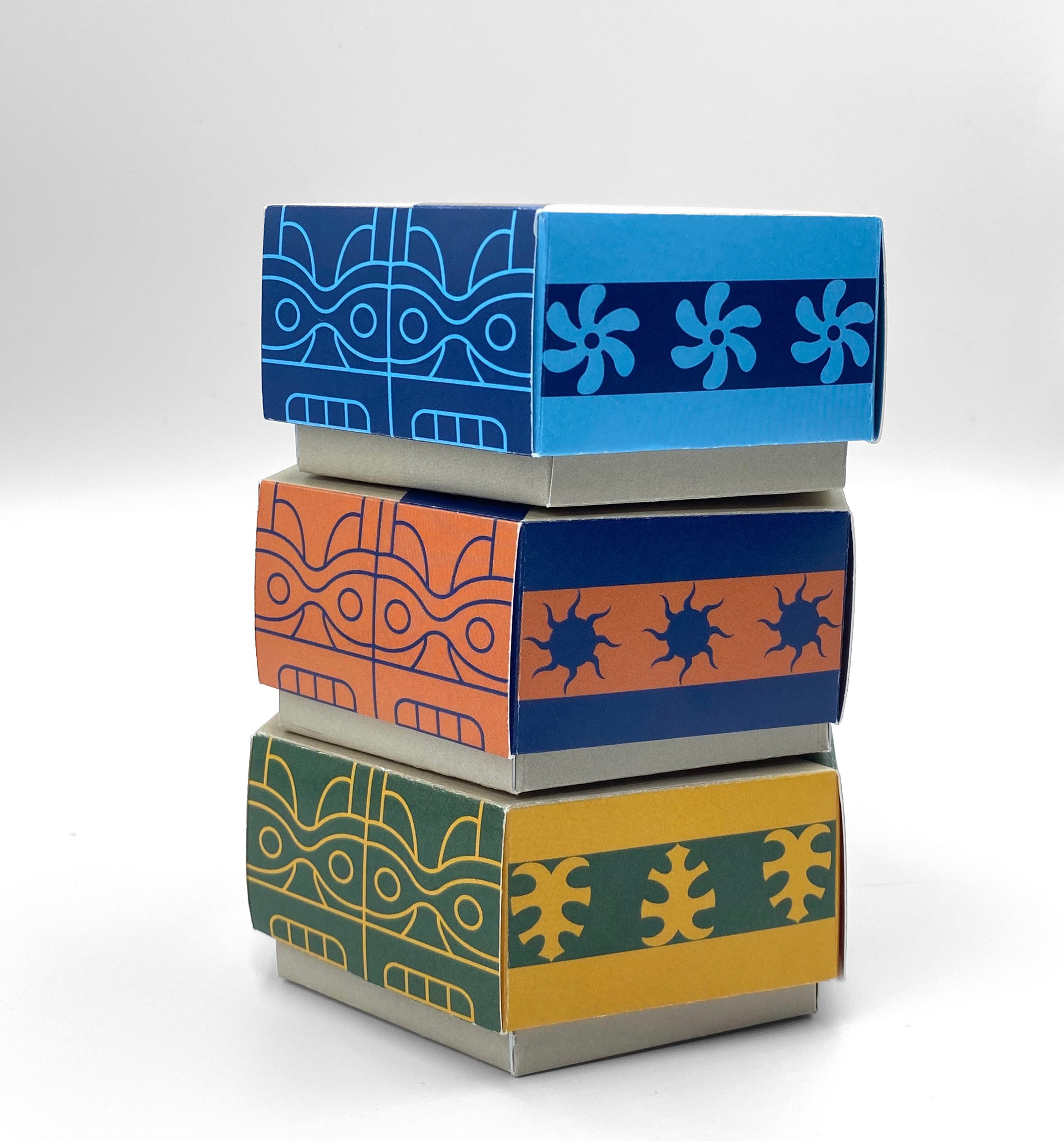
In order to facilitate easy identification of wax temperatures for surfers, I started by selecting colors that accurately conveyed the specific temperature range of each wax. Next, I developed distinct patterns for each wax type, which were based on the corresponding temperature range. Finally, to unify the overall system and further integrate the Hawaiian inspiration, I incorporated a tiki illustration into each packaging design, which was complemented by the temperature-specific color scheme.



Project Reflection
My Takeaways
The primary lesson I learned from this project is that achieving a well-developed product requires patience, simplicity, and most importantly, user testing. The design and packaging went through numerous iterations, and after countless sketches and paper mockups, I formed a systematic packaging that taught me to effectively align colors and patterns with a brand. Another significant takeaway from this experience is the importance of physically seeing and holding the work, rather than relying solely on screen viewings. When I printed the design, I discovered that the type appeared smaller or larger, the colors looked lighter or darker than expected, and the sizing of the mockup would either be too small, big, or uneven. That is why user testing with others was crucial to figure out if my product was working and holding well on its own. Overall, this experimental project was enjoyable, and it motivated me to explore packaging shapes beyond traditional boxes.
Further Development
Given more time, I would have enjoyed creating an actual wax or similar material mold to carve the shape of my box and test how well my final product would hold up. Additionally, I would like to expand the brand’s online presence by incorporating interactive elements on the website. For example, I could add a quiz or allow users to customize their own surfboards.


