Tipsy Slice
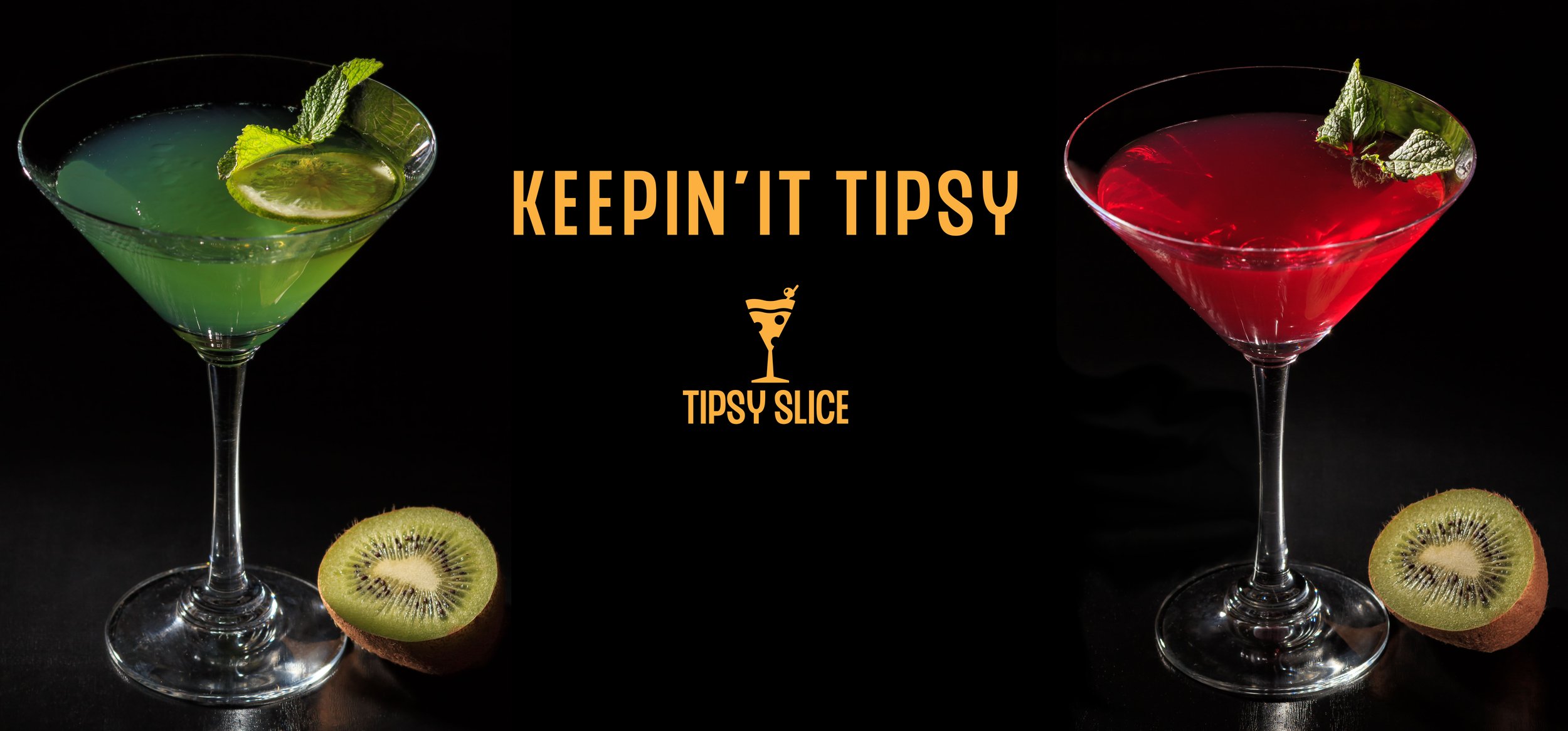
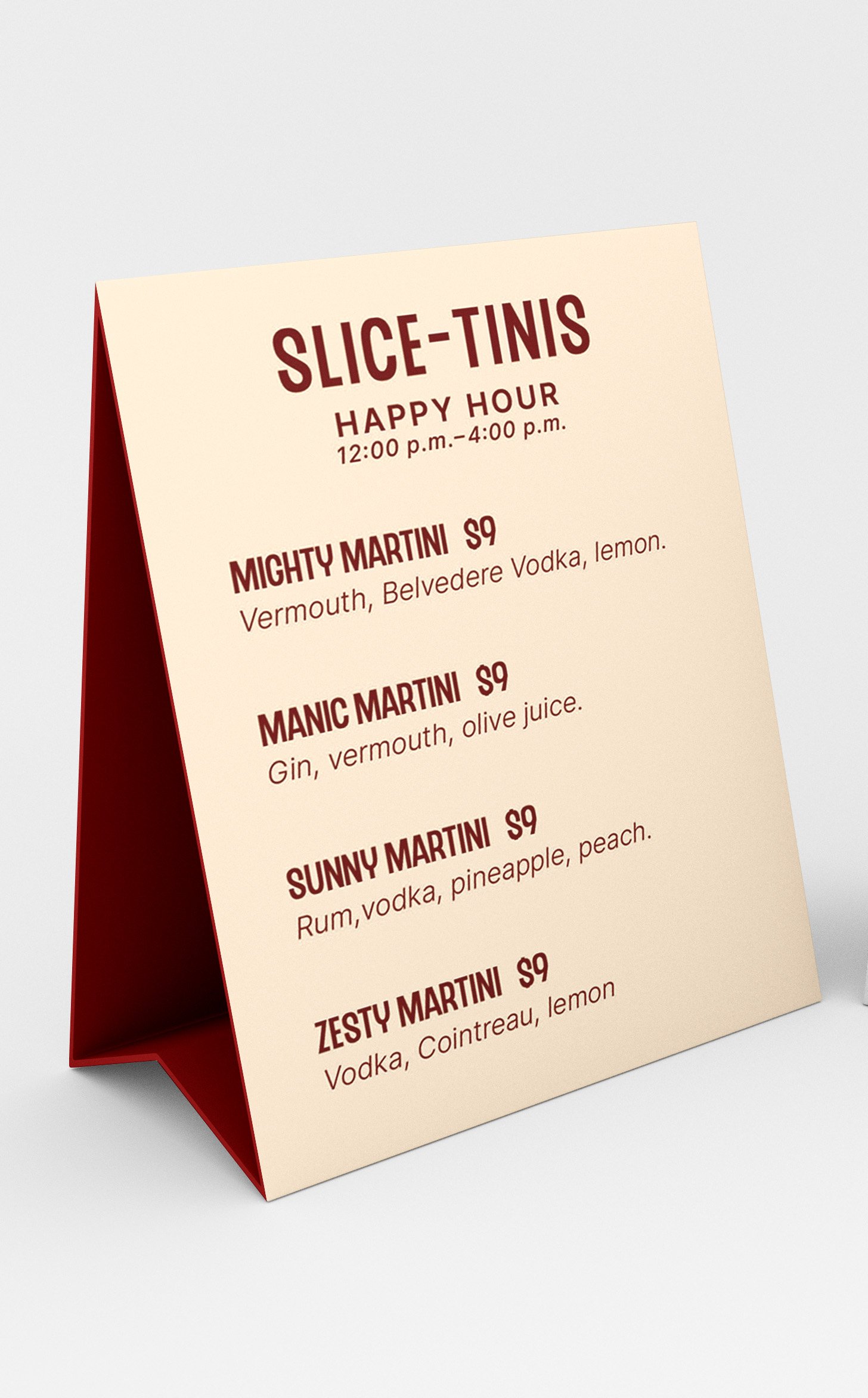
Tipsy Slice isn’t your typical pizza place, it’s a pizza and cocktail lover’s dream. Our delicious pies and martini selection will make you want to bring everyone you know so join the fun, grab a slice, and let’s get tipsy!
Branding

Inspired by cocktail and pizza enthusiasts, the Tipsy Slice reflects a simple design style with a minimal color palette and playful typography. The creation of Tipsy Slice began by forming a trademark that combined two distinct objects. A martini glass and a pizza slice. To showcase the brand’s light-hearted and fun personality, the name Tipsy Slice was formed from related cocktail and pizza idioms.
Approach


Project Reflection
My Takeaways
This project reinforced the idea that a brand can be defined by a simple typeface. When I initially set out to design a packaging box for the pizza, I was fixated on creating a pattern. However, I was not completely satisfied with the designs I had originally done due to the fact that they were not properly aligning with the logo and overall brand. As a result, I shifted my attention to the typeface and began experimenting with different words and phrases. This approach ultimately proved more effective in showcasing the brand's personality than a pattern would have.
Further Development
Given additional time, I would have enjoyed expanding the branding further and incorporating additional environmental graphic design elements. Additionally, I would have liked to enhance the website by showcasing the process of customizing and ordering a pizza. Furthermore, with more UI/UX elements, I would like to develop an app that enables customers to place orders and track their pizzas in real time.


